papa
an iterative redesign for senior accessibility

|
Papa is a service that pairs college students with senior citizens at home to actualize their slogan, “grandkids on demand.”
Working with a team of 4, we chose this startup because of the altruistic niche it fills: Papa strives to assist the often-forgotten or ignored demographic of the elderly in an effort to combat loneliness, which is becoming a larger and larger trend in said demographic. |
Initial Design Sketches
We chose to go with Version C of our sketches, since we thought Versions A and B were a bit too simple, and Version D could result in a crowded app.
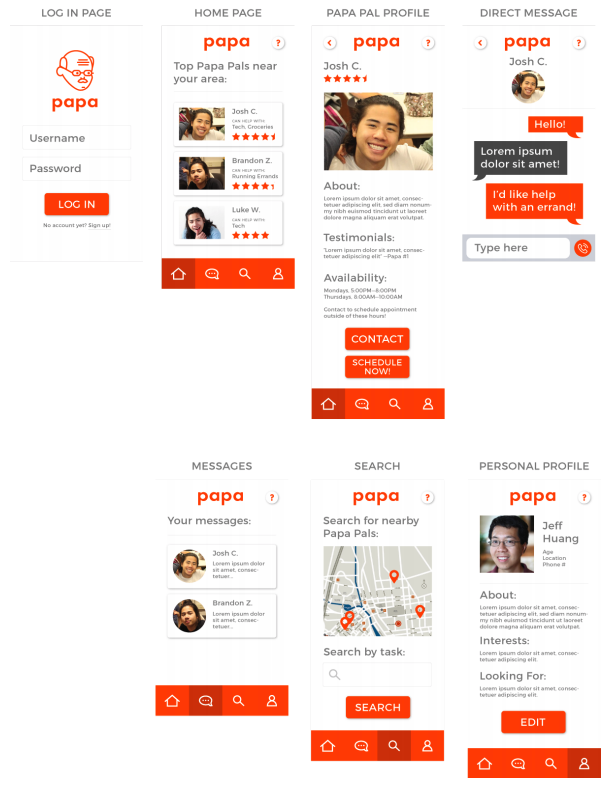
Hi-Fidelity Prototype
Interactive Link: https://projects.invisionapp.com/share/EAP3RSXQ57T
|
Our main goal was to create a user flow that was most intuitive for the seniors that would be using the application.
We chose to go with a bright color scheme with large buttons and large type sizes, and made the layouts of each page as minimal as possible so as not to overwhelm users who may not be as familiar with technology. The main focus of the experience is to facilitate correspondence between the user and the population of Papa Pals who could potentially be of help to them, so the user flow outlined in this prototype worked to do just that. The prototype has multiple avenues for users to find Papa Pals, and easy ways to get into contact with ones that have the right availabilities and skills. |
Eye-Tracking Data
In gathering eye-tracking data for our prototype, we hypothesized that a typical user flow will follow as:
Login --> Home --> Profile (Josh C.) --> Direct Message (Josh C.) with most of the time spent looking at large text and icons.
Login --> Home --> Profile (Josh C.) --> Direct Message (Josh C.) with most of the time spent looking at large text and icons.
Although our eye tracking data was slightly offset, most likely due to tester miscalibration, our data nonetheless supports our initial hypothesis. Once the user had gone past the login screen and reached the home page, they spent most of their time looking at the top/middle portions. In our case, the user spent most of the time on that page reading the instructions and then quickly jumped to looking at the top two options, eventually choosing Josh C after little deliberation. Once they had selected Josh C’s profile, the user skimmed through his bio as they scrolled down to eventually reach the “Contact” button. For this screen, since the user is scrolling through the page, it makes sense for most of the eye tracking to remain concentrated in one area because most people look relatively at a single spot while scrolling to prevent confusion. After clicking the button, the user was brought to the messaging page where they could successfully contact the grandkid that is good with tech and groceries and view all their past interactions. Overall, this flow felt very intuitive to the user as they had little to no trouble navigating through the first few pages to contact their desired grandkid. Furthermore, the bright colors and large icons were easily recognizable and usable as the user spent most of the time reading text as opposed to looking at items. As such, we expect future users to have similar easy experiences using the app.