Online Dining Hall Menus
an interface redesign
The Problem:
At Brown, we are very fortunate to have such a hard working dining services team that provides a multitude of dining options on a daily basis. However, when faced with such variety, it can become difficult to choose which eatery best fits one’s current needs and tastes. With unique choices such as Josiah’s daily or monthly specials or the VDub’s Finger Fridays, this “paradox of choice” only becomes harder for maximizers at Brown, seeking to get the best bang for their buck out of each meal credit. As such, the BUDS website should accommodate this desire by clearly displaying each eatery’s menu in a more efficient manner, allowing students to consider all their options easily.
Online Menu Link: https://dining.brown.edu/cafe/josiahs/
|
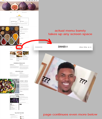
In its current state, the website is very cluttered by unnecessary images, windows, and information. While these images may be aesthetically pleasing, filling the page with appetizing ingredients, they take up far too much space and most aren’t even of the same meals that are actually served. Additionally, large windows and forms force the user to scroll through lots of content that may not be immediately relevant to them. Even after sifting through the page, the user can’t even find the menu until they expand a tiny circle that can easily be missed at a glance.
The original designers had most likely prioritized comprehensiveness in addition to aesthetics, intending to include as much BUDS information as possible, which could be hard to learn otherwise. However, without clearly prioritizing what users want and instead throwing everything and a literal kitchen sink into one page, the site becomes much harder to navigate. And while the menu buttons do alleviate some of these issues, the bar is too overcrowded and ultimately results in too much unnecessary movement throughout the page. |
The Solution:
Instead, I would opt for a more minimal approach to the website that clearly displays all immediately relevant information, efficiently utilizes space, and improves overall navigability:
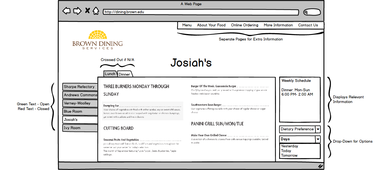
While this design certainly isn’t perfect, it allows the user to see all the information they want from the moment the page loads. The page also makes it intuitively clear which dining options are open by utilizing different font colors or options. By moving extraneous information elsewhere and getting rid of the large images, there is a lot more white space that makes page much easier on the eyes as well. Finally, the tab system serves as affordances for the user, allowing them to flip through different pages much like a physical menu. Overall, this is a good start to revamping the site as it more efficiently allows students to take full advantage of all the variety that BUDS has to offer.